r-ggplot2
速答
Q: 生信分析必须学 R 吗? A: 不是必须,但强烈推荐。Seurat(单细胞�)、DESeq2(差异分析)、clusterProfiler(富集)等核心包都是 R 生态。Python 有 Scanpy 等替代,但 R 在统计可视化和 Bioconductor 生态上仍占优。
Q: ggplot2 的图层语法核心是什么?
A: data + aesthetic + geometry 三件套。数据映射到美学属性(x/y/color),再叠加几何图层(点/线/柱)。图层之间用 + 连接,可以无限叠加。
Q: dplyr 最常用的 5 个函数?
A: filter()(筛选行)、select()(选列)、mutate()(新增列)、group_by() + summarize()(分组汇总)、arrange()(排序)。覆盖 90% 日常数据整理需求。
R 数据整理与 ggplot2 可视化
R 在组学分析中最常用的场景有两个:整理表格数据,画出能解释结果的图。对 BioF3 来说,本章不是追求完整覆盖 R 语言,而是让你掌握最常用、最容易迁移到真实项目的能力。
本章所有图表都来自公开数据集 10x Genomics PBMC 3k。它包含一名健康供体外周血单个核细胞的真实单细胞 RNA-seq 表达矩阵。
R 在 BioF3 中承担什么角色
R 不是唯一选择,但它在生信里非常重要:
- Seurat 是单细胞分析的主流工具之一
- Bioconductor 提供大量组学分析包
- ggplot2 和 ComplexHeatmap 适合发表级可视化
- R Markdown / Quarto 适合生成分析报告
学习 R 的重点不是背语法,而是知道数据对象长什么样、函数需要什么输入、结果如何保存。
准备真实 PBMC 3k 数据
先读取真实表达矩阵。完整脚本会自动下载数据;这里保留核心逻辑,方便你理解后续对象从哪里来。
library(Matrix)
library(dplyr)
library(tidyr)
library(ggplot2)
library(scales)

data_dir <- file.path(path.expand("~"), "biof3-data", "pbmc3k")
matrix_dir <- file.path(data_dir, "filtered_gene_bc_matrices", "hg19")

pbmc_url <- paste0(
  "https://cf.10xgenomics.com/samples/cell-exp/1.1.0/pbmc3k/",
  "pbmc3k_filtered_gene_bc_matrices.tar.gz"
)
pbmc_tar <- file.path(data_dir, "pbmc3k_filtered_gene_bc_matrices.tar.gz")

dir.create(data_dir, recursive = TRUE, showWarnings = FALSE)

if (!file.exists(pbmc_tar)) {
  download.file(pbmc_url, destfile = pbmc_tar, mode = "wb")
}

if (!file.exists(file.path(matrix_dir, "matrix.mtx"))) {
  untar(pbmc_tar, exdir = data_dir)
}

counts <- readMM(file.path(matrix_dir, "matrix.mtx"))
genes <- read.delim(file.path(matrix_dir, "genes.tsv"), header = FALSE)
barcodes <- read.delim(file.path(matrix_dir, "barcodes.tsv"), header = FALSE)

rownames(counts) <- make.unique(genes[[2]])
colnames(counts) <- barcodes[[1]]
counts <- as(counts, "CsparseMatrix")
把矩阵整理成几张常用表:
mt_genes <- grepl("^MT-", rownames(counts))

qc <- data.frame(
  cell = colnames(counts),
  nCount_RNA = as.numeric(colSums(counts)),
  nFeature_RNA = as.numeric(colSums(counts > 0)),
  percent_mt = as.numeric(colSums(counts[mt_genes, , drop = FALSE]) / colSums(counts) * 100)
)

gene_summary <- data.frame(
  gene = rownames(counts),
  total_counts = as.numeric(rowSums(counts)),
  detected_cells = as.numeric(rowSums(counts > 0))
) %>%
  mutate(mean_counts = total_counts / ncol(counts))

marker_genes <- c("IL7R", "CCR7", "S100A8", "S100A9", "MS4A1", "CD79A", "NKG7", "GNLY", "PPBP")
marker_genes <- marker_genes[marker_genes %in% rownames(counts)]

marker_long <- bind_rows(lapply(marker_genes, function(gene) {
  data.frame(
    cell = colnames(counts),
    gene = gene,
    counts = as.numeric(counts[gene, ]),
    log_counts = log1p(as.numeric(counts[gene, ]))
  )
}))
这几张表分别回答不同问题:
counts:基因 x 细胞的稀疏表达矩阵qc:每��个细胞的总 UMI、检测基因数、线粒体比例gene_summary:每个基因的总表达量和检出细胞数marker_long:常见 PBMC marker 基因的长表表达量
最小 R 基础
向量
向量是 R 中最基础的数据结构。这里的基因名来自 PBMC 3k 矩阵中真实存在的 marker 基因。
genes <- marker_genes[1:4]
expression <- gene_summary$total_counts[match(genes, gene_summary$gene)]

genes[1]
expression > median(expression)
mean(expression)
数据框
数据框类似表格,是生信分析中最常见的数据形态。
gene_data <- gene_summary %>%
  filter(gene %in% marker_genes) %>%
  select(gene, total_counts, detected_cells, mean_counts)

head(gene_data)
str(gene_data)
summary(gene_data)
访问列:
gene_data$gene
gene_data[["total_counts"]]
筛选行:
high_detection <- gene_data[gene_data$detected_cells > 100, ]
列表
很多 R 包会把复杂结果放在列表里。Seurat 对象、差异分析结果和富集分析结果都可能包含多层信息。
analysis_result <- list(
  counts = counts,
  qc = qc,
  marker_expression = marker_long
)

analysis_result$qc
dplyr:表格整理的基本动作
先加载包:
library(dplyr)
用真实基因汇总表练习筛选、排序和新增列:
top_genes <- gene_summary %>%
  filter(!grepl("^MT-|^RPL|^RPS", gene)) %>%
  filter(detected_cells > 50) %>%
  arrange(desc(total_counts)) %>%
  mutate(
    log_total_counts = log10(total_counts + 1),
    detection_rate = detected_cells / ncol(counts)
  ) %>%
  slice_head(n = 10)
分组汇总可以用在 marker 基因上。例如按基因统计非零表达细胞比例:
marker_summary <- marker_long %>%
  group_by(gene) %>%
  summarise(
    mean_log_counts = mean(log_counts),
    expressing_cells = sum(counts > 0),
    expressing_rate = expressing_cells / n(),
    .groups = "drop"
  ) %>%
  arrange(desc(expressing_rate))
在真实项目中,大部分绘图问题都先是数据整理问题。图画不好,常常不是 ggplot2 不会用,而是表格没有整理成合适的长格式。
ggplot2 的核心思想
ggplot2 使用"图形语法"。你可以把一张图理解成几层:
- data:使用哪个数据框
- aes:哪些列映射到 x、y、颜色、形状、大小
- geom:用什么几何对象展示数据
- scale:坐标轴和颜色如何转换
- theme:图的外观
- labs:标题、坐标轴和图例文字
最小示例:
ggplot(top_genes, aes(x = reorder(gene, total_counts), y = total_counts)) +
  geom_col(fill = "#0f766e") +
  coord_flip() +
  scale_y_continuous(labels = comma) +
  labs(x = NULL, y = "Total UMI counts") +
  theme_classic()
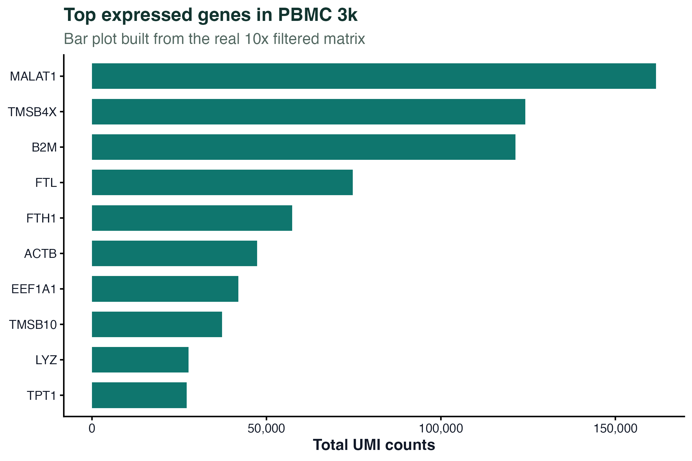
图 1:柱状图展示 PBMC 3k 中总 UMI 数最高的一组真实基因。这里过滤了线粒体和核糖体基因,避免它们占据整个图。
生信常用图表
散点图:看两个变量的关系
ggplot(qc, aes(x = nCount_RNA, y = nFeature_RNA, color = percent_mt)) +
  geom_point(alpha = 0.7, size = 1.2) +
  scale_x_continuous(labels = comma) +
  scale_y_continuous(labels = comma) +
  scale_color_gradient(low = "#0f766e", high = "#dc2626") +
  labs(
    x = "Total UMI counts",
    y = "Detected genes",
    color = "Mitochondrial %"
  ) +
  theme_classic()
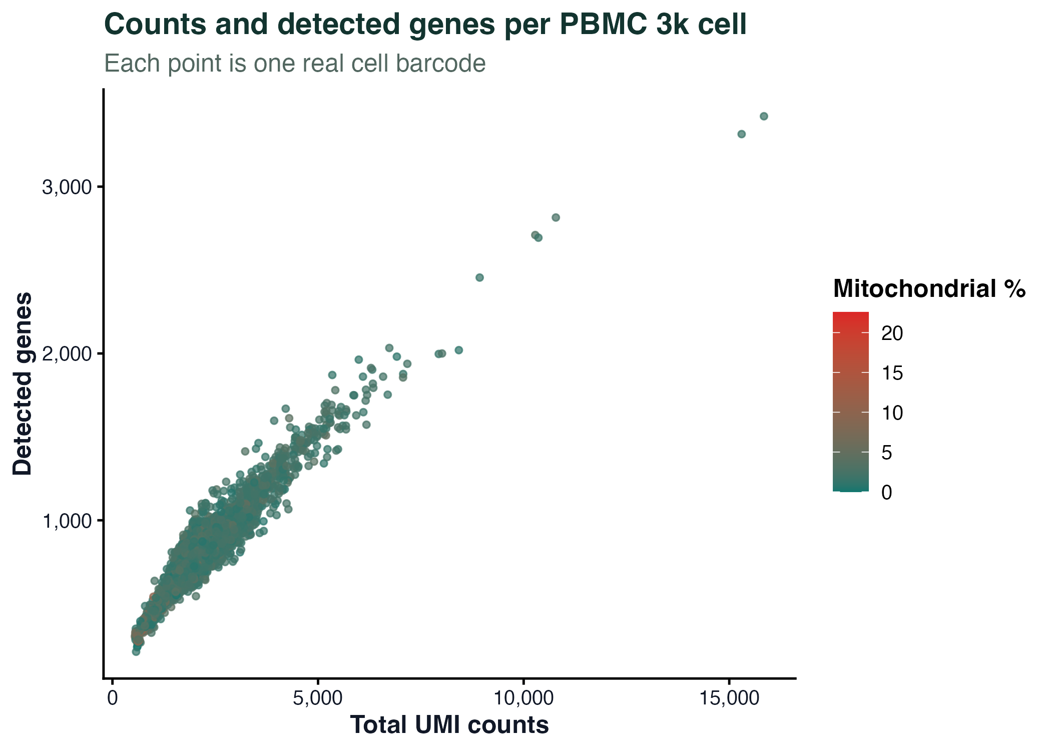
图 2:每个点是一个真实细胞条形码。散点图适合观察总 UMI 数、检测基因数和线粒体比例之间的关系。
箱线图:比较分组分布
box_data <- marker_long %>%
  filter(gene %in% marker_genes[1:4])

ggplot(box_data, aes(x = gene, y = log_counts, fill = gene)) +
  geom_boxplot(width = 0.6, outlier.shape = NA, alpha = 0.82) +
  labs(x = NULL, y = "log1p(UMI counts)") +
  theme_classic() +
  theme(legend.position = "none")
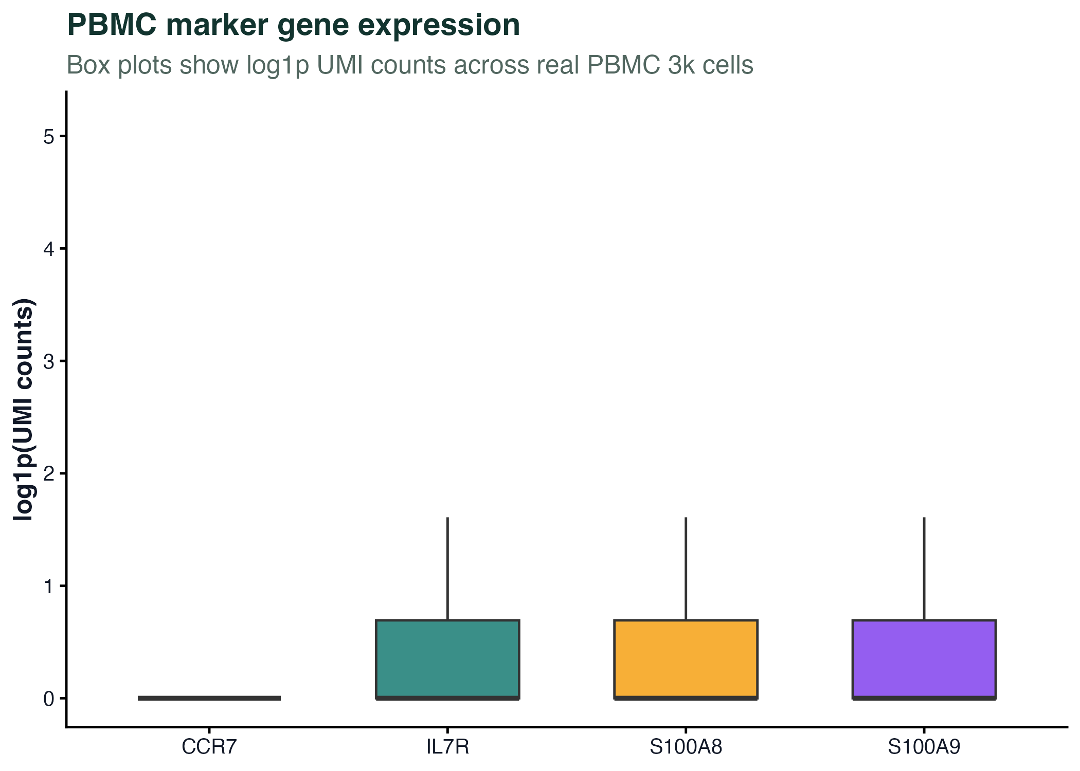
图 3:箱线图展示真实 PBMC marker 基因在全部细胞中的表达分布。单细胞数据里零值很多,所以图注必须说明归一化或转换方式。
直方图:看整体分布
ggplot(qc, aes(x = nCount_RNA)) +
  geom_histogram(bins = 55, fill = "#2563eb", color = "white") +
  geom_vline(xintercept = median(qc$nCount_RNA), linetype = "dashed", color = "#f59e0b") +
  scale_x_continuous(labels = comma) +
  labs(x = "Total UMI counts per cell", y = "Number of cells") +
  theme_classic()
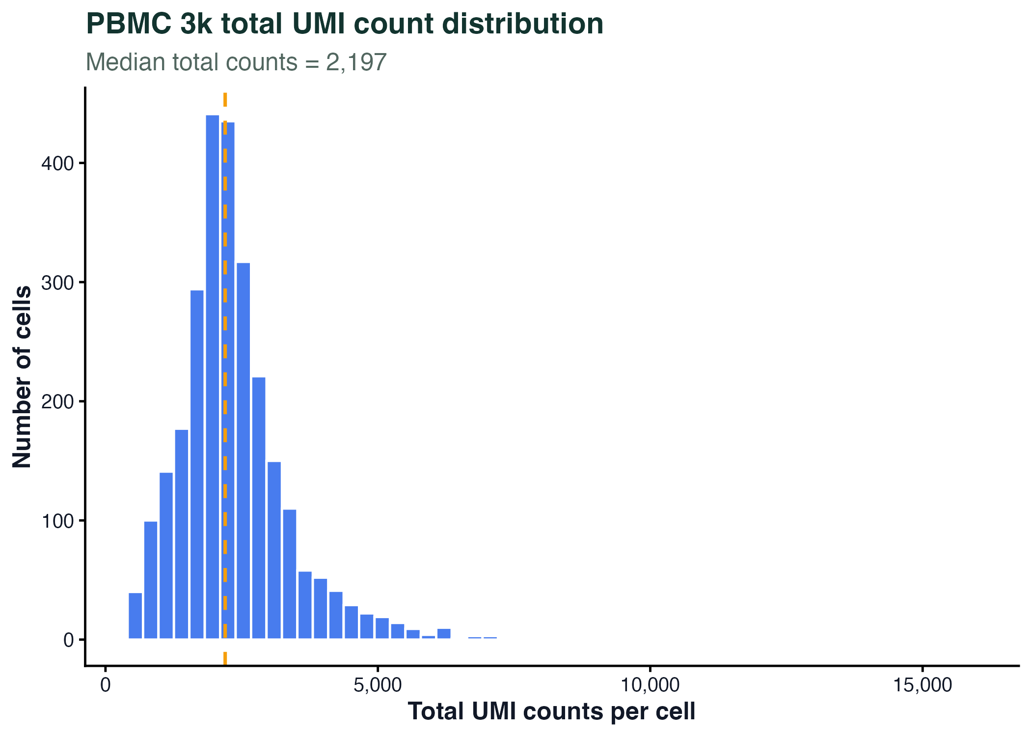
图 4:直方图适合观察真实测序计数、基因表达、QC 指标等连续变量的分布。
小提琴图:看分布形状
ggplot(box_data, aes(x = gene, y = log_counts, fill = gene)) +
  geom_violin(trim = FALSE, alpha = 0.72) +
  geom_boxplot(width = 0.12, fill = "white", outlier.shape = NA) +
  labs(x = NULL, y = "log1p(UMI counts)") +
  theme_classic() +
  theme(legend.position = "none")
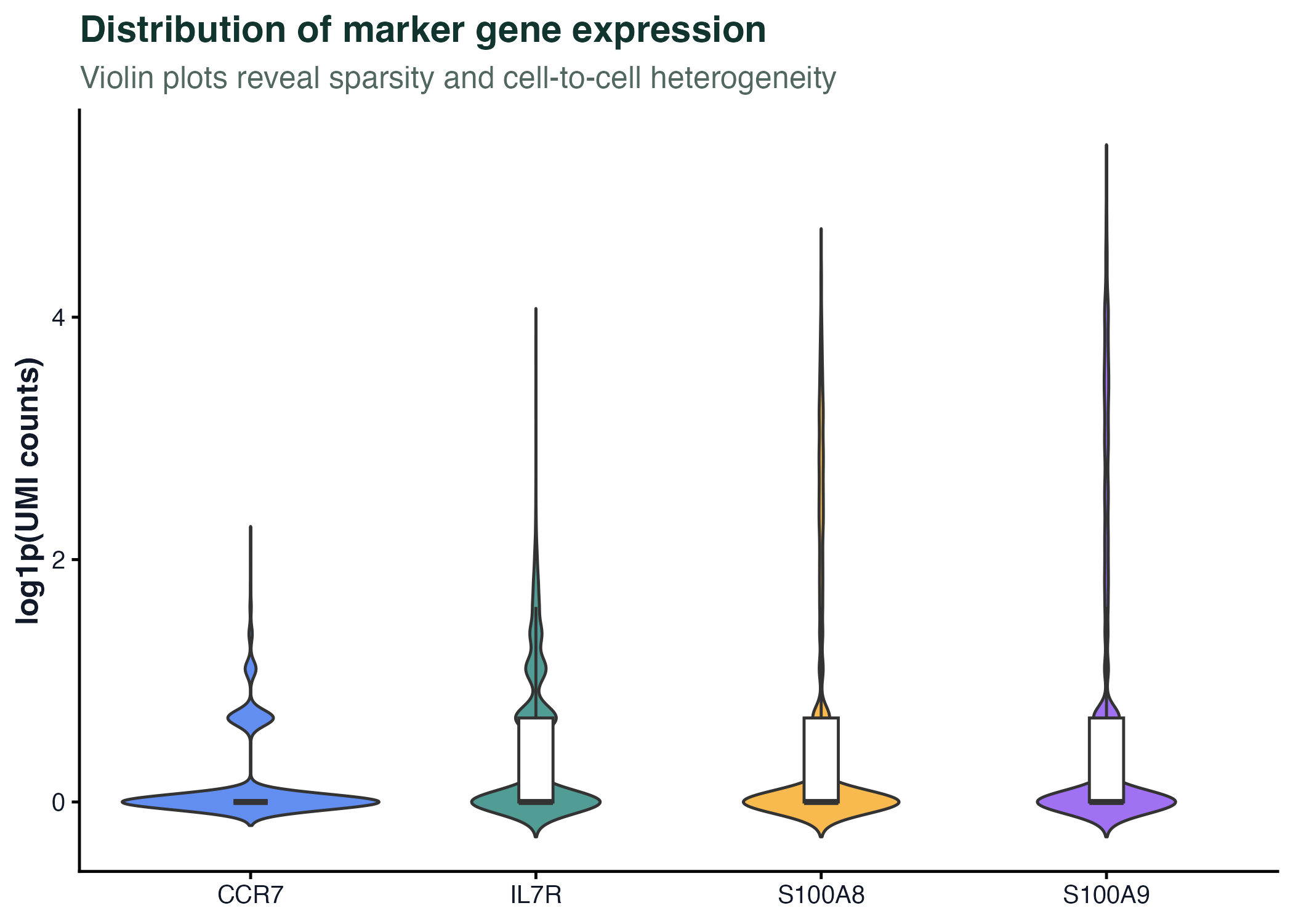
图 5:小提琴图适合展示大量细胞的分布形状。单细胞表达图常用小提琴图,但要注意零值、归一化方式和细胞类型混合带来的解释边界。
分面图:同时比较多个基因或分组
facet_data <- marker_long %>%
  filter(gene %in% marker_genes[1:6])

ggplot(facet_data, aes(x = log_counts)) +
  geom_histogram(bins = 35, fill = "#0f766e", color = "white") +
  facet_wrap(~ gene, scales = "free_y", ncol = 3) +
  labs(x = "log1p(UMI counts)", y = "Cells") +
  theme_bw()
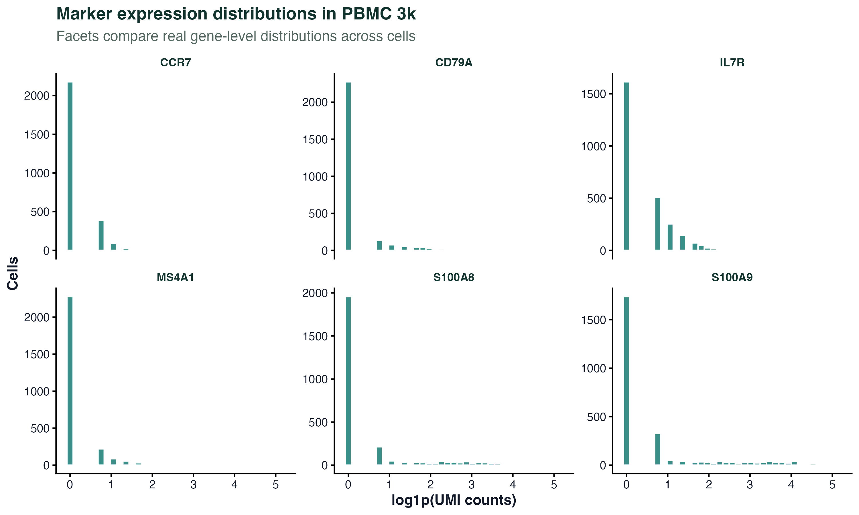
图 6:分面图适合在同一套样式下比较多个真实基因。这里每个小面板都是一个 marker 基因在 PBMC 3k 细胞中的表达分布。
一个小型表达分析流程
下面用 PBMC 3k 的真实 marker 基因演示从矩阵到长表、再到可视化的完整流程。
marker_expression <- counts[marker_genes, , drop = FALSE]

gene_long <- as.data.frame(as.matrix(marker_expression)) %>%
  tibble::rownames_to_column("gene") %>%
  pivot_longer(
    cols = -gene,
    names_to = "cell",
    values_to = "counts"
  ) %>%
  mutate(log_counts = log1p(counts))
可视化表达分布:
ggplot(gene_long, aes(x = gene, y = log_counts, fill = gene)) +
  geom_violin(trim = FALSE, alpha = 0.72) +
  geom_boxplot(width = 0.1, fill = "white", outlier.shape = NA) +
  labs(x = NULL, y = "log1p(UMI counts)") +
  theme_classic() +
  theme(
    legend.position = "none",
    axis.text.x = element_text(angle = 30, hjust = 1)
  )
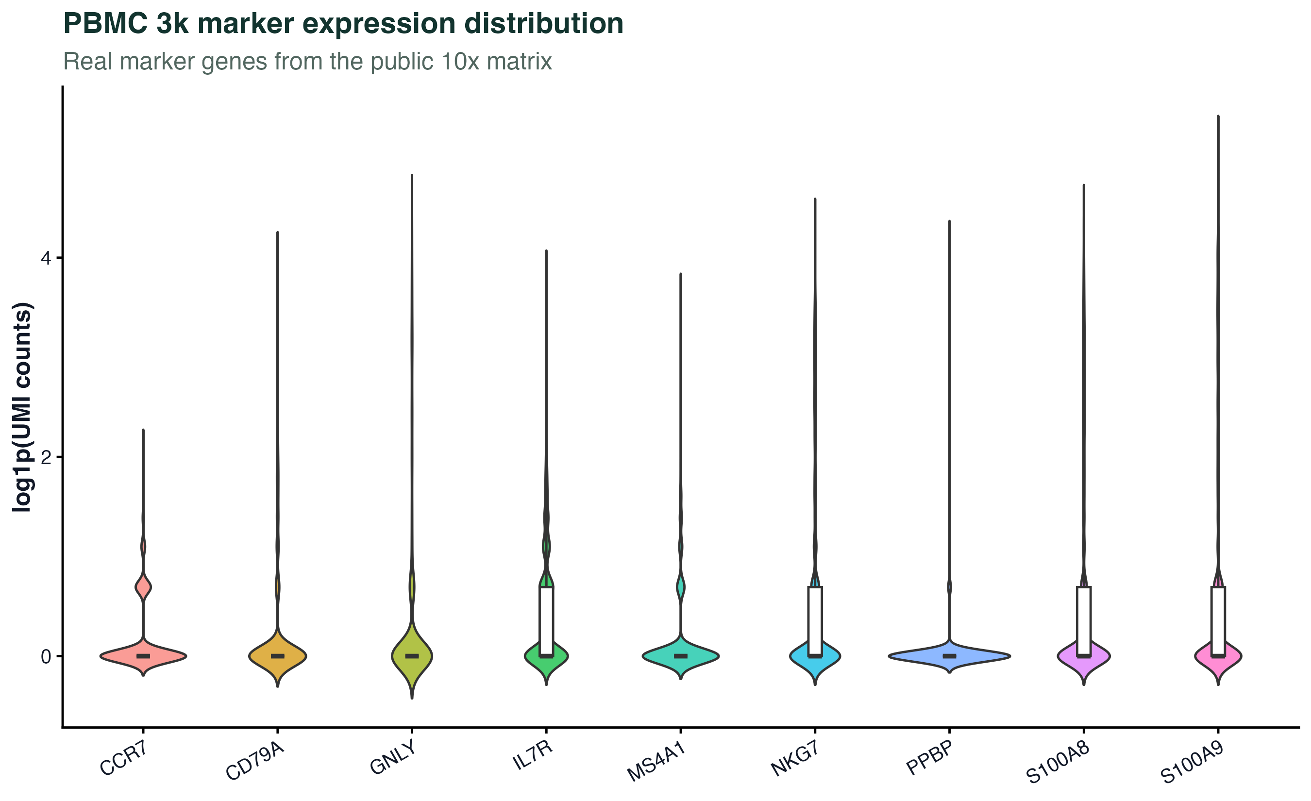
图 7:表达量分布图可以快速检查不同 marker 基因的稀疏性和表达范围。它不是差异分析结果,不能直接推断细胞类型比例或显著性。
基因检出、丰度和热图
火山图通常需要两类信息:
- x 轴:log2 fold change
- y 轴:显著性,例如
-log10(adjusted p-value)
PBMC 3k 这一章还没有建立分组差异分析模型,所以这里不画"正式火山图"。如果没有真实分组、真实 log2FC 和校正后的 p 值,就不要把图包装成火山图。我们改用真实基因层面的检出细胞数和总 UMI 数,观察哪些 marker 基因在矩阵中更常被检测到。
gene_detection <- gene_summary %>%
  filter(detected_cells > 0) %>%
  mutate(marker = if_else(gene %in% marker_genes, "Marker gene", "Other gene"))

ggplot(gene_detection, aes(x = detected_cells, y = total_counts, color = marker)) +
  geom_point(alpha = 0.45, size = 1) +
  scale_x_log10(labels = comma) +
  scale_y_log10(labels = comma) +
  labs(
    x = "Cells with detected expression",
    y = "Total UMI counts",
    color = NULL
  ) +
  theme_classic()
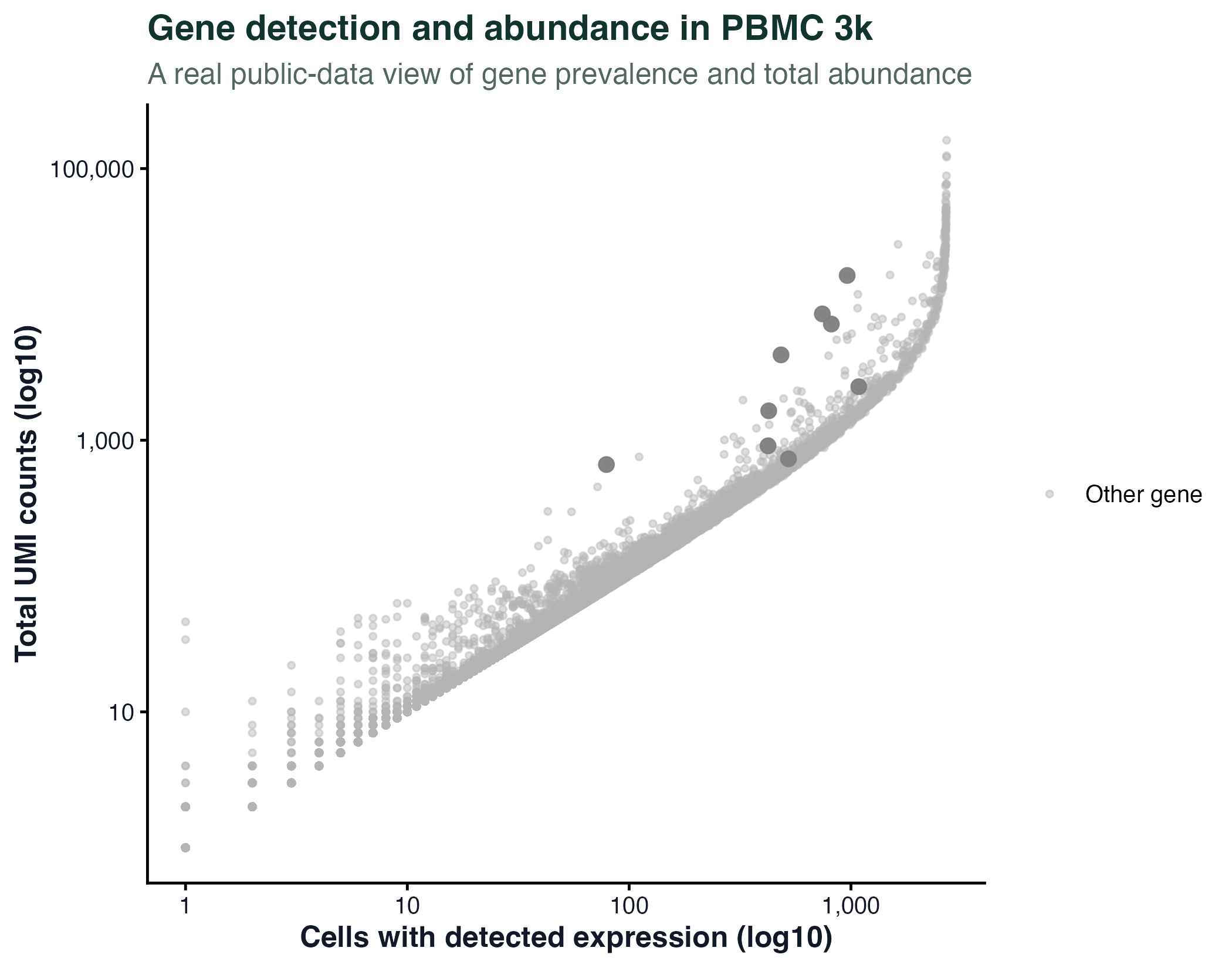
图 8:这不是火山图,而是 PBMC 3k 真实基因的"检出细胞数 vs 总 UMI 数"散点图。它保留了原文件名以兼容网站旧链接。
热图适合展示一组基因在多个样本或细胞中的模式。常见注意点:
- 是否按行标准化
- 是否显示聚类
- 是否展示样本分组注释
- 颜色是否有清晰含义
- 基因数量是否过多
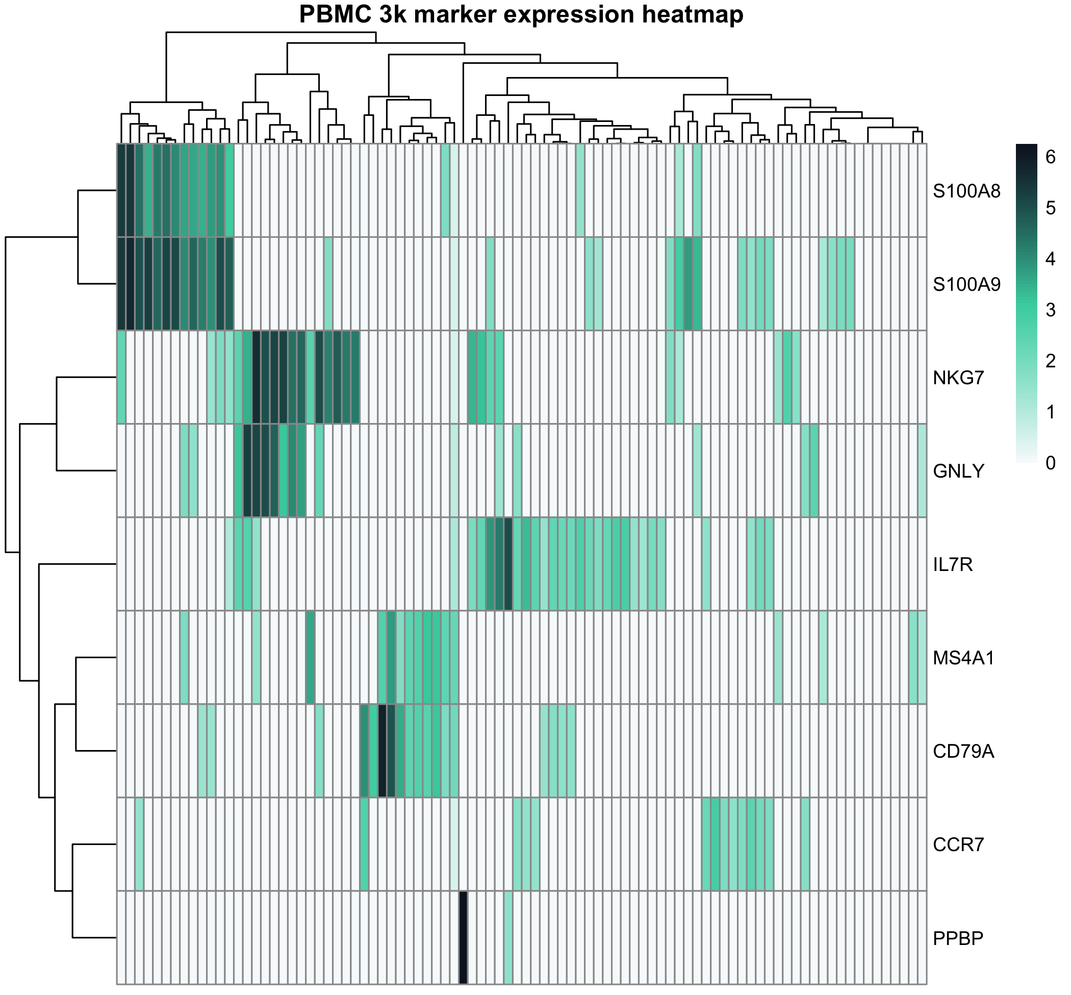
图 9:热图展示 PBMC 3k marker 基因在一组真实细胞中的表达模式。热图适合展示模式,而不是替代统计检验。
保存图片
建议所有图都显式保存,避免只留在 Notebook 或 RStudio 窗口里。
ggsave(
  filename = "results/figures/pbmc3k_marker_distribution.png",
  width = 7,
  height = 5,
  dpi = 300
)
保存前确认:
- 图片尺寸是否适合论文或网页
- 字体是否清晰
- 坐标轴是否有单位
- 图例是否能解释颜色
- 文件名是否能看出内容
AI 辅助改图
AI 可以帮你把"能画出来的图"改成"更清�楚的图":检查坐标轴、图例、颜色和图注,或者把宽表改成适合 ggplot2 的长表。具体提示词和安全边界详见 AI 辅助编程与智能体工具。
但下面这些事情必须自己判断:
- 用箱线图还是小提琴图是否符合数据量
- 是否应该展示每个细胞点,还是用分布图避免过度拥挤
- 是否需要多重检验校正
- 是否能从图上得出生物学结论
- 图注是否准确描述了数据处理方式
常见坑
坑 1:宽表直接喂 ggplot
新手最常见的报错。手里一份"基因 × 样本"宽表,想画图直接 ggplot(data, aes(...)),发现 ggplot 不认。
避免:ggplot2 要长表(long format),用 tidyr::pivot_longer() 把宽表转成长表再画。
wide <- data.frame(gene = c("A","B"), s1 = 5, s2 = 10)
long <- tidyr::pivot_longer(wide, cols = -gene,
                            names_to = "sample", values_to = "expr")
坑 2:对数轴上展示包含 0 的数据
UMI counts 包含大量 0,直接 scale_y_log10() 会把 0 的样本静默扔掉。看图以为没 0 值,其实是被 ggplot 滤掉了。
避免:先做 log1p()(log(x+1))转换再画,或显式把 0 替换成一个小值并加图注说明。
坑 3:颜色映射用了连续变量但其实是分类
把"分组"列存成数字(1, 2, 3)而不是 factor,ggplot 会用渐变色画,逻辑混乱。
避免:分类变量明确转 factor — data$group <- factor(data$group)。
坑 4:图保存出来文字模糊
直接 ggsave("plot.png") 默认 dpi=300 但宽高没指定,画出来字小到看不清。
避免:每次保存都明确 width = 7, height = 5, dpi = 300,论文用图至少 600 dpi。
坑 5:用 RColorBrewer 时类别超过调色板上限
scale_color_brewer(palette = "Set1") 最多 9 色,画 12 个细胞类型就报 warning,部分类别会变灰。
避免:超过 9 类时用 scale_color_manual() + 自己定义颜色,或用 ggsci / viridis 包的扩展调色板。
下载资源
下一步
基础入门到这里告一段落 — 接下来是用真实流程练习。
接着深入:
- 单细胞实践 01:实践数据集与数据获取 — 把本篇练的 R + ggplot2 用在真实单细胞数据获取流程上
- 单细胞实践 03:质量控制、聚类与细胞类型注释 — 第一个完整的 scRNA-seq 分析,全程用 R
- bulk RNA-seq overview — 想做转录组而不是单细胞的话从这里进
横向延伸:
- FigCode 火山图、热图、PCA — 跟本章学的语法一致,可直接套用真实数据
- 数据与环境准备 — 跑本章脚本前如果环境没装好,先走这一篇
- AI 辅助编程 — 用 AI 检查图、改图、补图注
参考资源
- 10x Genomics PBMC 3k 数据集:https://www.10xgenomics.com/datasets/3-k-pbm-cs-from-a-healthy-donor-1-standard-1-1-0
- ggplot2 官方文档:https://ggplot2.tidyverse.org/
- dplyr 官方文档:https://dplyr.tidyverse.org/
- R for Data Science:https://r4ds.hadley.nz/
- Bioconductor:https://www.bioconductor.org/
离线资料下载
手册 HTML / PDF 已在后台预生成,点击后直接下载网站静态资源。